Problem-Solving Case Study — Best Krazy Chicken (BKC)
Overview
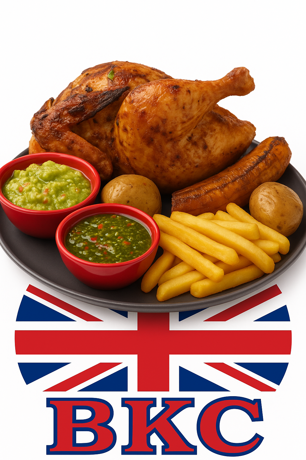
Best Krazy Chicken (BKC) is a restaurant concept designed to compete with established UK chains by offering Colombian-style wood-fired rotisserie chicken with authentic flavours and traditional side dishes. The goal is to pair strong product quality with a clear, modern digital presence.
Context
BKC features chicken marinated with Colombian spices and roasted slowly over firewood. Side dishes include wood-roasted or fried potatoes, roasted ripe plantain, cassava, and homemade sauces like ají and chimichurri. This fills a gap in the UK market with flavours not currently offered by mainstream competitors.
Challenges And Opportunities
- Challenge: Competing with well-known chains and building brand recognition from scratch.
- Challenge: Communicating a new flavour profile to UK customers.
- Opportunity: Unique Colombian wood-fired taste and efficient rotisserie service for fast delivery.
- Opportunity: Digital channels (website + social) to reach local communities and drive footfall.
Design Choices
The website was designed with a focus on clarity, consistency, and accessibility. A clean layout with soft pistachio and sky-blue tones reflects the brand’s calm and natural identity while ensuring strong contrast for readability. Navigation uses a clear “pill” style link for easy wayfinding, and consistent icons reinforce a cohesive visual system. The structure follows a simple visual hierarchy that highlights important content, supported by flexible containers and a responsive grid that adapts smoothly across screen sizes.
Forms and buttons feature proper focus states, large interactive areas, and clear color contrast for accessibility. Metadata integration (Open Graph and Schema.org) enhances visibility on search engines and social platforms. These design foundations established a consistent visual language that informed the development of other pages — including the restaurant problem-solving project — ensuring a unified, professional, and user-friendly experience across the website.
Concept for the Problem-Solving Page
The design of the Problem-Solving Page was created to reflect the restaurant’s digital transformation goals, focusing on improving customer interaction and simplifying communication. A clean and modern layout was chosen, featuring clear sections for social media links, contact information, and an interactive booking form. These sections allow users to engage directly with the business, demonstrating how modern web technologies can support real customer relationships.
The warm color palette and easy-to-read typography make the page welcoming and professional, reflecting the identity of a family-friendly restaurant environment. A mobile-first design approach ensures that navigation, call-to-action buttons, and forms remain usable on all screen sizes, maintaining accessibility and responsiveness. The interface also follows W3C accessibility principles with clear focus indicators, logical structure, and high color contrast.
Overall, the page balances aesthetics and usability, achieving a clear and functional design that supports the business objectives of visibility, trust, and customer engagement. This section also demonstrates my ability to integrate HTML, CSS, and JavaScript to build a cohesive and user-centered business solution.
Design Concept: Expandable Menu (Arrow/Accordion)
To enhance interactivity and performance, the restaurant menu was implemented as an expandable “arrow/accordion” interface instead of displaying all dishes at once. Each category (e.g., Starters, Mains, Desserts, Drinks) is represented by a clear section header with an arrow icon that rotates when expanded. This design reduces visual clutter, improves load time, and helps visitors focus only on the category they want to explore.
When a section expands, customers can view dish photos, descriptions, and prices within a structured layout that adapts to different screen sizes. This interaction motivates users by creating a sense of control and discovery while keeping the overall page lightweight and easy to navigate. Few images load initially, improving accessibility and performance, and all content is organized in a logical reading order that supports screen readers.
Overall, the expandable menu enhances user experience by presenting menu items clearly, minimizing cognitive overload, and aligning with the restaurant’s digital transformation goals through a clean, modern interaction pattern.
Outcome / Results
The final website successfully demonstrates all design and technical objectives defined throughout development. The multi-step checkout form includes a realistic credit card simulation, allowing users to experience a safe and professional process without real transactions. The interactive restaurant menu ensures smooth navigation, fast response, and logical organization of content across all sections.
Accessibility features, such as focus indicators, descriptive labels, and alternative text, guarantee inclusive access for every user. Both HTML and CSS passed W3C validation, confirming semantic structure and compliance with web standards. Consistent layouts and clear typography support readability, responsiveness, and device compatibility.
Beyond meeting design goals, this project enhanced my understanding of user-centered development and the value of accessible, efficient, and visually coherent web solutions. The outcome reflects not only technical proficiency but also awareness of business needs — delivering a polished, functional, and customer-focused product aligned with professional web development standards.
Social Media & Contact Links
- Facebook: facebook.com/crazzychicken
- Instagram: @crazzychicken
- Email: J.E.CastroCastillo@edu.salford.ac.uk
- Phone: +44 1234 567890
💬 BKC Assistant
Have a question about my projects or problem-solving process? Ask the BKC Assistant anything about this site.
Tip: Try questions like “What is BKC?”, “Where are you located?”, or “Who is José Castro?”